TherapyNotes.comBehavioral Health EHR

Designing beyond the screen in a complex billing system

In a mature healthcare platform the interface can be the smallest part of a change. I worked across eligibility, AI-assisted remittance import and insurance-card OCR. I went beyond just the screen to find data meaning, product risk, technical feasibility, and to ensure the quality of what got shipped.

Role
Senior Product Designer - Billing
Timeframe
2025 - 2026
Product
Behavioral-health EHR & Practice Management
Areas
Insurance, Eligibility, Claims, Payments, AI and OCR
Collaborators
Product Managers, Executive Team, Engineers & QA

05.01The best place for eligibility wasn't where the product typically put it

A request to show eligibility alongside insurance information turned into a harder problem: reconciling new payer data with an existing policy without breaking the user’s current workflow.

05.01.01The Original Request

Show eligibility response details where the user was at and when the user needed it.

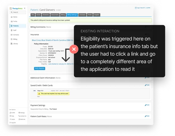
TherapyNotes already offered insurance eligibility checks, but users had to navigate away from what they were currently doing to see the returned eligibility information. A more contextual interaction sounded simple: request eligibility and show the response right alongside the stored insurance information.

Eligibility responses arrived as a 271 transaction that carried a lot of useful information like coverage, subscriber and patient data, plan details, benefit categories, deductibles, copays and more.

Displaying the payer’s eligibility data alongside the patient’s insurance info was a great idea, but It turned out that the real challenge was when the returned information conflicted with what the user already had entered in TherapyNotes.

TherapyNotes patient billing settings showing the existing eligibility check, with an annotation explaining that users had to navigate elsewhere to read the response.

05.01.02What I Investigated

I had to understand the 271 data before I could design a flow that handled all the potential conflicts that could occur.

I researched the 271 deeply enough to understand where the information we needed appeared in the 271 spec: which loops and segments contained what we needed, where the information would appear in multiple locations instead of one location and what downstream billing consequences could happen if we let the user change the policy.

That understanding led us to consider a comparison-and-merge design instead of just letting the user blindly overwrite their existing information. This was no longer an import feature, it was a reconciliation process.

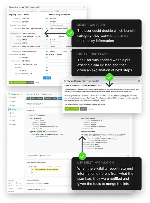
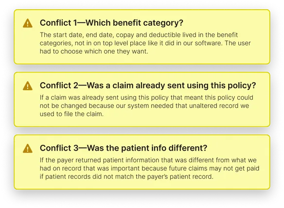
The interface needed to take the user through the following decisions: Which benefit category to use for start date, copay and deductible, how to handle if a claim was pending or already paid using this policy and what to do if the patient had new contact information from the payer.

Three eligibility reconciliation conflicts: choosing a benefit category, preserving the policy used for an existing claim, and handling patient information that differs from the payer’s records.

05.01.03what changed in the design

The design had to protect the record, not simply replace it. I solved the original ask by putting the eligibility information on the same page where the user was working, but more importantly I worked through field mappings, merge states and exceptions rather than just designing the happy path.

The user needed to see the differences clearly, make deliberate choices and preserve their intent instead of blindly trusting the payer response as a replacement. That change was the result of understanding the problem more completely.

Some values couldn't be merged at all and changing certain policy identifiers—such as member ID, policy group or policy holder—could matter differently when claims had already been paid or partially paid.

The emerging screens optimized for the necessary use cases: run eligibility from the patient's billing settings, show the status there, and move into persistent discrepancy work when necessary.

This was part of this design process I really valued: the more accurately I understood the data and workflow, the better the user’s experience became because I could anticipate many of the user’s needs before the user encountered them.

Three green checkmarks highlighting changes to the eligibility workflow.

05.02The interface wasn’t the biggest risk

Uploading a provider EOB and extracting payment information was the requested feature. The hard question was whether the AI had enough representative evidence to do that reliably—and what the product should do when it didn't.

05.02.01The happy path

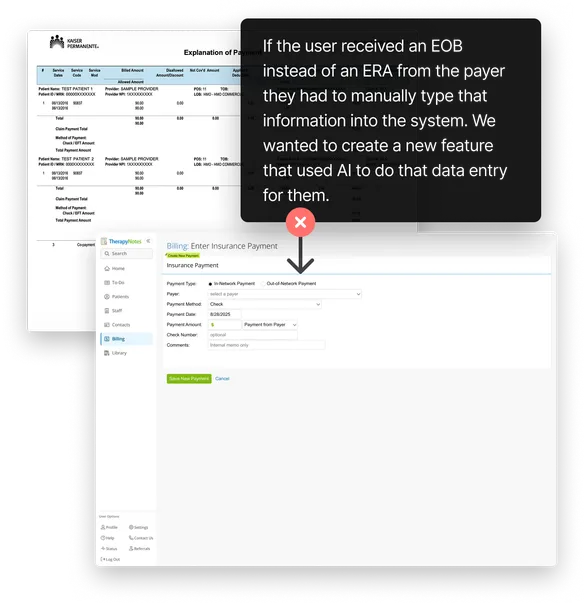
Providers often received provider EOB information in PDFs or images instead of usable ERA data, which meant their staff had to manually re-enter payment information into TherapyNotes.

The proposed feature would let a user upload that EOB PDF and then the Azure-based document AI processing would turn it into structured data that would get fed into the existing payment system.

But the requirements I had only described the happy path. I still needed to know what happened when the AI extraction went sideways, because that answer would change the UI and what the user needed to do next.

When our product managers were too overwhelmed I volunteered to investigate the possibility of errors myself. What I found was critical.

A provider explanation of benefits beside the TherapyNotes insurance payment form, illustrating the manual data entry that AI-assisted remittance import aimed to automate.

05.02.02What I uncovered

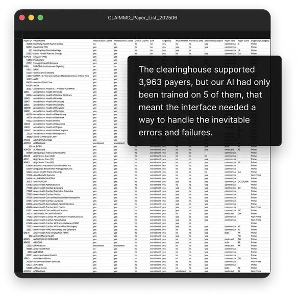
The AI model we had created was only trained on a very small sample of EOB examples, 5 to be exact, yet through our clearinghouse we supported roughly 3,963 payers each with their own unique EOBs.

That did not prove the feature would always fail but it did show that we did not yet have the evidence that the happy path was the only path that needed to be designed. In fact handling failures was the most likely path to occur and we needed a design that could handle it.

I inspected the available example documents, compared them with the clearinghouse payer landscape, and then talked with our billing, engineering and analytics teams to understand exactly how the system pulled and stored the data from the EOB.

The question became, what exactly are the kinds of errors that could occur during the import process and how should we handle each kind of possible error?

Clearinghouse payer list with an annotation contrasting 3,963 supported payers with five AI training examples, highlighting the need to design for extraction errors and failures.

05.02.03What changed in the design

Different failures required different recovery. We needed to separate a total extraction failure from a usable result containing questionable fields.

A complete failure might require someone to do manual entry with the source still visible and a partial result demanded review, correction and approval before posting.

That meant treating an original EOB as a working reference during review, not merely as an attachment that disappeared after upload. I designed a comparison interface toward the following outcomes:

Hard stop — The import could not safely continue, so we would send the EOB directly to our customer support team where they would resolve the import manually and build a log of what was causing import errors.

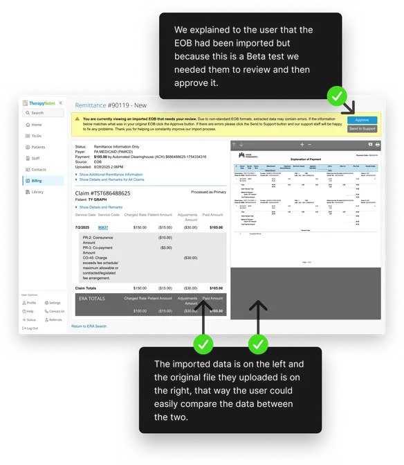
Review required — The import produced usable structured data but our validation checks flagged that verification was needed by the user. We would then show the user the imported result alongside the original document so the user could review, correct and approve it.

Success — Even if our validation checks returned all green lights we felt that it was still important for the first release to always ask the user to review the results. With the right communication and a beta test group as our first audience we could respond to error patterns quickly and safely until we eventually removed the review process as we improved the importing system.

TherapyNotes remittance review screen showing imported payment data alongside the original EOB, with a review notice and options to approve the import or send it to support.

05.03The work didn't end once the concept was approved

This project shows the other side of my work: detailed interaction design, explicit handoff and staying involved throughout the development process until the design was live in production.

05.03.01Getting the details right

Our detailed review loop accelerated how quickly I learned the product.

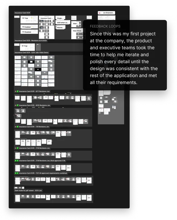
This project was one of my first major TherapyNotes projects. It went through multiple rounds with stakeholders which included detailed executive reviews.

The amount of refinement was demanding, but it also gave me an accelerated education on the product's interaction language: which existing patterns mattered, where consistency was expected, how edge states were handled and how precise the final behavior needed to be.

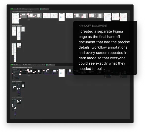
By the time I reached the handoff stage, I had annotated the interaction details explicitly, checked the visual values intentionally, added tablet and mobile responsive states and also added the dark-mode versions.

Insurance-card OCR design iterations in Figma, showing successive review rounds and dark-mode designs, with an annotation describing feedback from the product and executive teams.

05.03.02Preparing for handoff

I treated handoff as a durable communication problem.

Later, in a senior-design discussion about peer review and dev-ready handoff, I articulated the reason for that level of clarity: weeks can pass between a design walkthrough and implementation, the Jira ticket can drift behind an evolving design, and Engineering or QA may return to the work with less context than they had in the original conversation.

My goal was not to eliminate collaboration or insist on one annotation method. It was to make the artifact durable enough that people could tell what changed, which conditions mattered and what needed to be built without depending on perfect memory.

The engineers and their product owner later told me that what I had handed them was exactly what they needed to write Jira tickets and execute what needed to be built.

Final insurance-card OCR handoff document in Figma, with annotated workflows, tablet and mobile layouts, and matching dark-mode screens prepared for development.

05.03.03Testing during development

Most important, I stayed involved when the design became code. Before I started design QA, I scheduled time with the developer and product owner to explain how I wanted to work through the review and make sure we agreed on the process.

That relationship mattered. Design QA can feel like someone arriving late to point out everything engineering did wrong. I wanted the developer to know that I cared about the shared result, that I had documented the design carefully, and that I would work through discrepancies with him rather than throw a screenshot of red circles over the wal

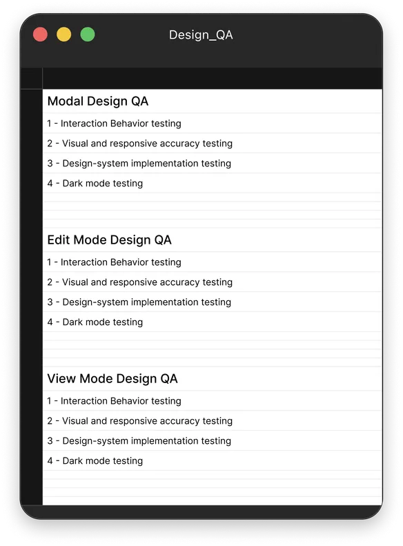
The implementation arrived in three major segments: the modal, edit mode and view mode. For each segment my design QA had four review steps:

1. Interaction behavior — verify every annotated requirement from Figma worked as written.

2. Visual and responsive accuracy — compare the implementation against the intended UI and at the sizes I had designed.

3. Design-system implementation — inspect the rendered code and verify that the appropriate design-system variables were actually being used.

4. Dark mode — confirm that the alternate theme behaved and looked like the design rather than treating it as an afterthought.

I created Excel sheets where I logged the bugs I found with screenshots and detailed reproduction information. Across the review process I logged more than 20 implementation issues that the developer then fixed.
Design QA checklist for modal, edit, and view modes, covering interaction behavior, visual and responsive accuracy, design-system implementation, and dark mode.

05.04Three projects, Three ways to follow through

Understand what the data actually means

Eligibility forced careful reconciliation of payer responses, stored insurance information and downstream financial constraints.


Test whether the product promise holds up

EOB OCR forced investigation of source quality, AI uncertainty, failure recovery and evidence-led rollout.


Stay until the design becomes software

Insurance Card OCR went from technical investigation to approved design, engineering handoff, detailed QA and production.

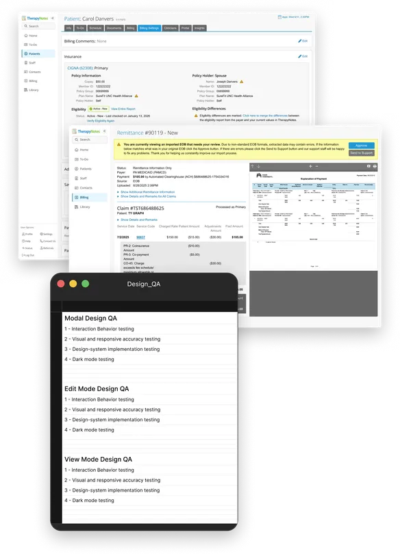
A collage of the three TherapyNotes projects: eligibility reconciliation, EOB remittance review, and the design QA checklist for insurance-card OCR.