CHG Healthcareprovider credentialing software

Turning a 358-page credentialing hairball into a usable system

This case study shows how I approached a huge, messy enterprise workflow: challenge the framing through research, map the full scope, reduce the experience to reusable patterns, and leave the team with a credible system instead of a pile of one-off screens.

Role
Senior & Lead Product Designer
Team
3 PMs, 2 Dev Teams, 1 Designer
Area
Provider Digital Experience (PDE)
Window
Feb 2020 → Oct 2020
Status
Strategic redesign / architecture work
What Changed
Mobile-app assumption → System redesign
01.01Credentialing was not ‘a form,’ It was a giant operational workflow

Before I could improve the experience, I had to understand the shape of the work itself.

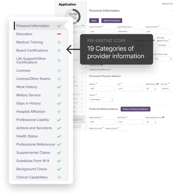
For providers, credentialing is the long, document-heavy process of proving they are qualified to work a given assignment. In CHG’s provider portal, that meant a huge web application asking for 19 categories of information ranging from education and training to licenses, work history, sanctions, references, background checks, and clinical capabilities.

The important thing was not just that there was a lot of content. It was that the application mixed dense data entry, conditional logic, uploads, lists, reviews, signatures, and specialty-specific sub-flows. This was far bigger than a conventional “form redesign.”

CHG’s provider credentialing application showing 19 categories of provider information alongside the personal information form.

01.02The project started with the wrong assumption

The team called it the “mobile app” project. The research said otherwise.

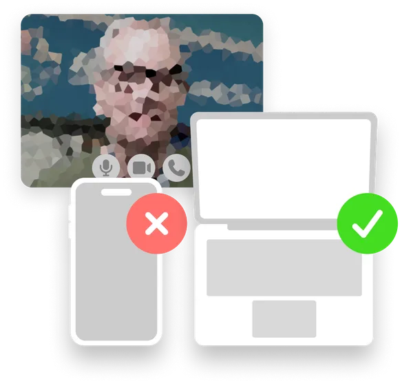
One of the first things I pushed for was direct user research. Providers quickly told us they did not want to do this process on a phone. They were working from large sets of documents, they needed multiple sessions, and they wanted a mouse and keyboard.

That finding changed the project. We stopped treating “mobile” as the primary goal and started treating workflow clarity, speed, and manageability as the real goals. In other words, the project became an application redesign, not a mobile project.

Provider interview with a phone marked with a red cross and a laptop marked with a green check, illustrating providers’ preference for completing credentialing on a computer.

01.03Before redesigning anything, I mapped the existing system

I needed the full scope in front of the team before anyone started rebuilding all the pieces of it blindly.

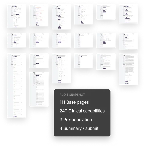
I audited the entire credentialing application and documented the findings in Confluence. That made the scope concrete and showed the team why this could not be approached casually. The old experience had grown around requirements and implementation pressure, not around a coherent user experience.

The audit also surfaced the most serious UX problems: too many fields crammed onto single screens, deeply complicated clinical-capability sub-flows, and multiple mental tasks forced onto the same screen before a single save.

Audit of CHG’s existing credentialing screens documenting 111 base pages, 240 clinical capabilities, 3 pre-population pages, and 4 summary and submission pages.

01.04I found the smaller system hiding inside the bigger one

After mapping the whole experience, I started looking for the patterns.

The breakthrough was realizing that 358 pages were really combinations of much smaller parts.

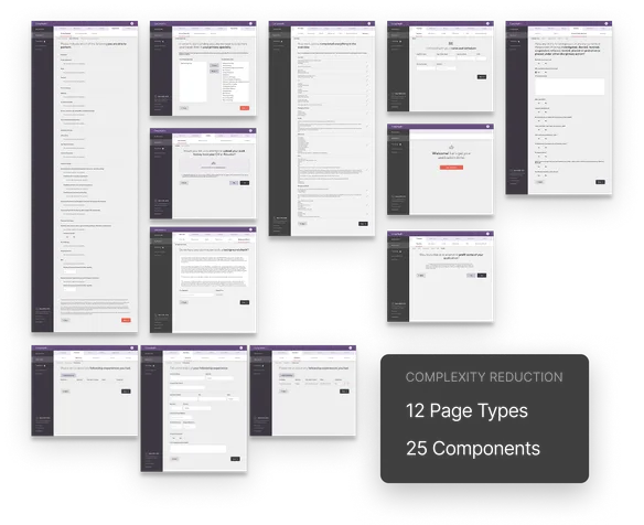
I found 12 page types and 25 components. Instead of worrying about 358 unique pages we could start by just focusing on 37 smaller pieces. The reduction was enormous and the scope became much more manageable.

At this point the product stopped being a large pile of screens and started to become a system.

CHG credentialing screen designs showing how the workflow was reduced to 12 reusable page types and 25 components.

01.05I designed the system, not hundreds of one-off screens

Once the system was visible, I could define what a better version of it needed to be.

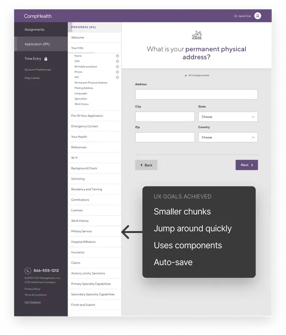
I documented clear UX goals for the redesign: break the work into smaller chunks, let users jump around, build in a PDE component library from the start, make everything responsive-ready, auto-save throughout the process, and improve naming and grouping so the whole experience was easier to follow.

One idea from this project has stayed with me: Easy to use is not one big gesture, it is the accumulation of many small interaction decisions made well.

Redesigned CHG credentialing address form with section navigation and a callout highlighting smaller chunks, quick navigation, reusable components, and auto-save.

01.06Research revealed a bigger opportunity than just redesigning the form

The providers were really describing a profile-management problem, not just a form-completion problem.

As the research continued, a larger insight emerged: providers hated re-entering the same information across their careers. They wanted a persistent place where their documents and professional information could live and be reused over time.

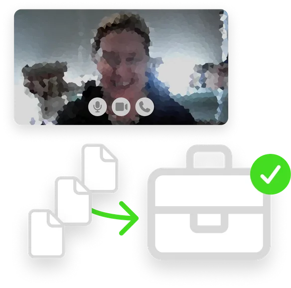
That moved the discussion toward profile persistence, document reuse, and eventually OCR-driven auto-fill — a much more strategic direction than “make a better form.”

Provider research interview above documents moving into a briefcase with a green check, illustrating the opportunity to store and reuse professional information.

01.07I worked embedded with Product and Engineering the whole way

The research, audit, and system model stayed close to the people who would actually needed them.

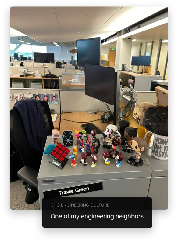
I was the dedicated designer on the PDE team. I sat with engineering, attended stand-ups and backlog grooming, and stayed closely connected to implementation conversations. That setup made it easier for the work to influence the team in real time rather than living as a disconnected design artifact.

This is one of the clearest examples of the kind of cross-functional environment where I do my best work: close enough to product and engineering that the strategy, the workflow thinking, and the implementation can continuously inform each other.

An engineering neighbor’s desk in CHG’s open office, decorated with collectible figures, illustrating the shared workspace with the engineering team.

01.08The biggest change was not cosmetic—It was conceptual clarity

The team left with a far better understanding of the problem and a more credible way to solve it.

The redesign work gave the team something more valuable than nicer screens: a real scope map, a pattern-based architecture, clearer UX goals, and a stronger product understanding. We avoided building around the wrong primary goal, and we had a better answer to where simplification should actually come from.

Even though this project lost momentum after significant org changes, the strength of my story is the strategic design work itself.

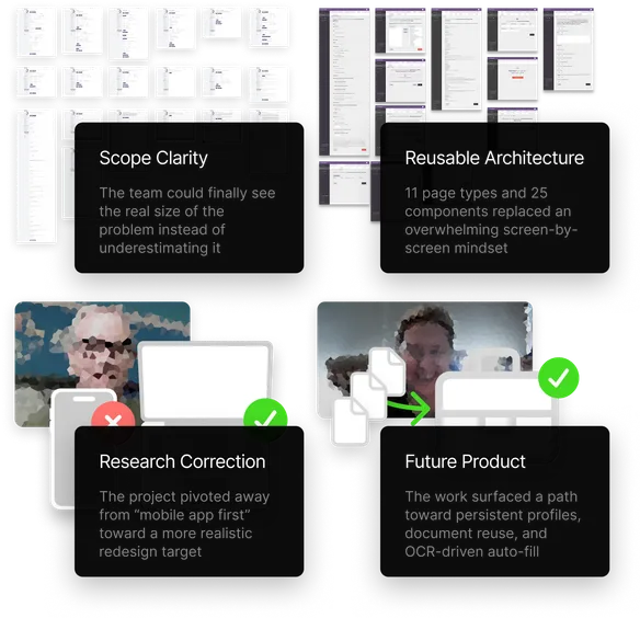
CHG project outcomes showing scope clarity, reusable architecture, research shifting the focus away from mobile, and opportunities for persistent profiles, document reuse, and OCR-driven auto-fill.

01.09What this taught me about designing huge systems

This project clarified the kind of design work I am best at.

When I am handed a giant enterprise workflow, I do not start by pushing pixels. I zoom out, map the territory, talk to users early enough to challenge the framing, look for repeated structures, and turn the mess into something the team can finally hold in its head.

That is what happened here. Research saved us from solving the wrong problem. Systems thinking saved us from trying to solve the right problem in the wrong way. And the result was a much more credible path forward than the team had when we started.

For me, this is one of the clearest examples of systems-level product design: make the problem legible, give it structure, and help the team move from “this is a hairball” to “now we know how to build this.”